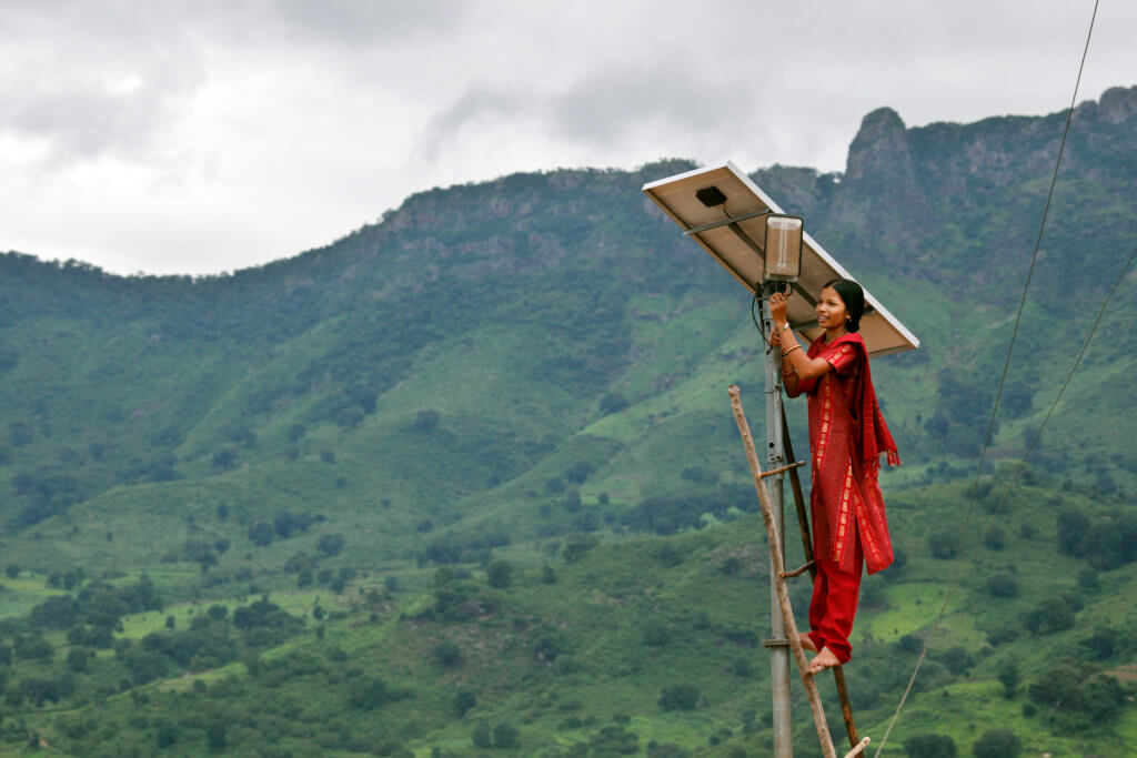
Meenakshi Dewan tends to maintenance work on the solar street lighting in her village of Tinginaput, India (photo by Panos shared under a creative commons licence)
Recently, we have seen how the language we use is evolving to more accurately reflect the environmental crisis that we face. For example, inoffensive terms such as “climate change” are now being replaced by expressions such as “climate emergency” and “global heating” is now preferred to the gentler “global warming” by many journalists. This, of course, has implications for the language we present to our learners and we require these terms to be regularly updated as the situation changes.
However, less has been spoken about the kinds of images we choose to exemplify the crisis. These also need to change to reflect our new reality. As a materials writer for more than twenty years I am acutely aware of the limitations that ELT publishers place upon us in terms of safe and sanitized content. In common with a lot of ELT content, images which reflect the climate crisis tend to be very safe, almost comfortable representations. This blogpost examines ways we can rethink the images used to reflect the climate crisis in our materials and the different angles which these images might lead us to focus on.
Taking a step back
If we take a look back at how the climate crisis was covered in ELT materials around a decade ago, we can come across some interesting examples. I co-authored an adult C1 level coursebook in 2010 and, looking at the unit entitled “Climate”, we see at the start a photo of entrepreneur Richard Branson tossing a map of the world ball in the air. There then follows a short listening activity focusing on Branson’s offer of $25 million to anyone who can identify a way to reduce greenhouse gases. On the next page, a series of five images then show different futuristic ideas for fighting global warming and a text explaining what these scientific experiments consist of. These images show initiatives such as the launching of rockets loaded with sulphur, huge glass sunshades in space, plankton farms in the sea and artificial trees – in fact they seem to be straight out of science fiction. The interesting thing about this approach is that the climate crisis is shown visually as being mainly of interest to entrepreneurs and scientists and is far removed from the realities of the students themselves.
The next lesson is a bit of an improvement and focuses on glaciers in Greenland. We see a black and white photo of a glacier as it was many years ago adjacent to a colour photo of the glacier as it is now. I say this is an improvement because it does show a real context (and not a fictitious or hypothetical one) but once more it is an image of the climate emergency we are very accustomed to seeing, it has been normalised to the point of being almost “comfortable”. In actual fact, the most stereotypical image of all is the polar bear stranded on a melting iceberg. In many online image archives, if you key in the words “climate change” – icebergs, glaciers and polar bears is what you get. These images feel so distant from our experience, and have become so familiar, they’re easy to ignore. And that’s where the problem lies.
Taking a look at another coursebook series written at around the same time but at a much more basic level (A2), we find an information panel entitled “Climate Change: The signs are here”. On this page we see different parts of the world (including Greenland again) and thumbnail images reflecting each phenomenon. Although some of the images have negative connotations – we see the typical parched earth and dried-up lakes and forest fires – others are aesthetically quite pleasing. For example, we see “Africa” and the accompanying text “areas of desert increasing” and this is accompanied by a beautiful image of sand dunes. Likewise, we see “New Zealand” and the text “oceans getting warmer”, the image is an aerial view of a beautiful unspoiled bay with yachts. The contradiction between the image and the text sends a confusing message to learners.
The images represent, once again, distant realities from the students’ lives and, as some of them are not particularly worrying, they have very little impact. In fact they trivialize the whole concept of climate change. On the next page we then see a photo of the poster of Al Gore’s film “An Inconvenient Truth” and we hear different people talking about their impressions of the movie. Once again, the topic of climate change is removed from the students’ lives as the focus is on a movie which they most probably would not have seen and one that is somewhat removed from mainstream culture.
Taking a step forward
Clearly, in the last ten years, the narrative has changed as the climate crisis has become increasingly more urgent. We now require new images to reflect this changing reality. However, the images in coursebooks (though perhaps not so elitist) remain similarly abstract or remote from our realities. One thing that was missing in all of the images mentioned up to now is that there were no people present in them. Rather than showing an image of a forest fire, it is much more effective and accessible if people are present in the shot, especially if they are directly affected by the fire. The crisis suddenly becomes more immediate and accessible to learners. But what kind of person should it be?
As a materials writer, I am familiar with looking at online image archives such as Getty, Alamy and Shutterstock. It is simple enough to search for an image using particular filters such as the number of people, etc. However, it is true to say that in the majority of these sites the images that you find do not look real or authentic. For example, in a recent unit for a teenage course I had to search for an image of a bushfire in Australia. There were any number of quite posed shots of people calmly gazing at the flames, often men with their back to us, striking a defiant pose. Editors tend to be happier with these kinds of shots because they are not too disturbing, the disaster is shown but at a distance. Unfortunately, however, this, once again, trivializes the issue and creates less impact. What is needed, however painful it may be to look at, is a real person faced by a real fire close to where they live and fleeing from the flames.
This search for a real image – which is not airbrushed or posed – is featured in an excellent Guardian article. Although written from a journalistic perspective, it is of great relevance to our work as it picks up on the disconnect between the comfortable, even frivolous, image and the seriousness of the topic which we find so often in ELT materials. As the article says, “getting the emotional tone of imagery in line with the issue is critical”.
The same article refers to the organization Climate Visuals which run an evidence-backed programme for climate change photography and offer a series of practical guidelines for selecting images which accurately reflect the global climate crisis. Whether you are a materials writer or simply looking for images for use in the classroom, this is a very useful resource and its findings, I believe, offer us a way forward. It is available as a PDF here for your reference and includes a survey based on images which focus on climate causes, climate impacts and climate solutions.
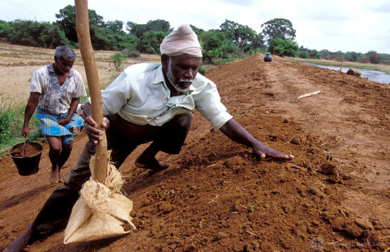
Men work on repairing flood barriers in Sri Lanka. Images that show solutions are important to counteract the potential overwhelm of focusing exclusively on negative impacts. (Photo by the World Bank shared under a creative commons licence. )
Most useful from an ELT practitioner’s point of view are the seven key findings that emerged from the group’s research. When looking for images online, it is a good idea to bear in mind these criteria:
1 The presence of people is crucial
However, as mentioned above, these should be real people in real situations and not staged or posed photo-ops. Logically, a single person is easier for people to identify with than a group. Eye contact in particular captures the viewer’s attention as do images which tell personal stories. If we can both see the person and read their own words, all the better. Likewise, animals can make a huge difference to an image’s impact, but again if we see that they are directly affected by an incident, not just in the normalised image of the pristine polar bear. On the contrary, politicians or celebrities posing for photos was disliked in the Climate Visuals’ research – we return to the Richard Branson idea.
2 Tell new stories
Again, rather than the polar bear image, the Climate Visuals research found that less familiar (and more thought-provoking) images can help tell a new story about the climate crisis or at least give a different angle on a known topic. However, the image should be easily understandable and not too obscure or specific. They suggest that using poignant humour or subversion may be a way to get a different kind of message across and give the example of a man watching television in a waterlogged living-room to show the seriousness of rising sea levels.
3 Show climate causes “at scale”
It is important to highlight the links between the climate crisis and daily lives as very often people don’t understand the connection. “At scale” here refers to society in general rather than the individual. Therefore, if you want to show a form of problematic behavior such as driving in a smog-filled city, then this should be shown via a traffic jam involving lots of different cars and not via an image of a single driver which might provoke defensive reactions.
4 Climate impacts are emotionally powerful
Images showing climate impacts, such as a landscape affected by severe drought, are very effective but can be overwhelming and ultimately depressing. One key way to lessen this is by coupling these with images which offer solutions to this problem. So, for example if you want to show an image of drought, it’s a good idea to combine that with an image that shows an initiative that is helping people face that problem.
5 Show local but serious climate impacts
It is important to focus on local contexts which learners can relate to, but at the same time indicate that this example is part of the bigger picture of the climate crisis. If the examples are too localized, they could be seen to be trivializing the issue.
6 Be careful with protest imagery
Many viewers respond negatively to images of protestors because they don’t relate to them, they believe that environmentalists are a certain kind of person and they don’t feel an affinity. It is important to focus on different protests around the world to show the global reach of these movements but it may be more effective to show protest images of people directly affected by climate impact.
7 Conclusion: Understand your audience
The last of the seven findings is an obvious one but an absolutely key one for ELT practitioners. If you are a materials writer working for a mainstream ELT publisher, it may just not be possible to include a particular image often because it is construed to be too depressing as many ELT materials have an upbeat, aspirational focus. However, a compromise can often be reached. In the end, the image of the Australian bush fire agreed upon for the teen course that I mentioned above did not include a real person suffering the consequences of the fire in context because it was considered too upsetting by editors. An image with a kangaroo was preferred instead. From the image it is clear that the kangaroo’s habitat had been affected by the fires and that this would spark an affective response in the viewer. The other nice thing about this image is that the disaster is merely implicit – there is an abandoned street and smoke hangs in the air. The bush fire itself stays in the viewer’s mind. It certainly has a good deal more impact than simply showing a landscape in flames.
To finish on a positive note, the team at Climate Visuals have created their own image library online which includes images from some of the best photo journalism sites such as Panos and Magnum (some, though not all, are available under a creative commons licence).These include far less posed images than the other online image archives. Check out the news section on their website for other worthwhile initiatives. These resources may well help you find the perfect image for your purpose and context.
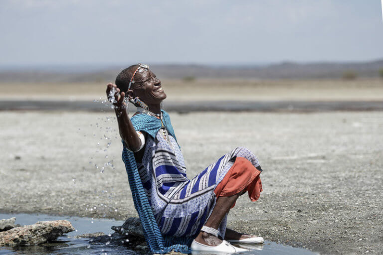
A Maasai woman is sprinkling her feet with hot spring water, believed to be medicinal. Lake Magadi is among the salt lakes that will vanish in approximately 15 years due to human encroachment and climate change. A striking photo that tells a personal story can be very impactful. (Photo by Global Landscapes Forum shared under a creative commons licence).
Ben Goldstein lives in Barcelona and works as an English teacher, teacher trainer and materials writer. He has taught for over twenty years in the UK, Spain and Hong Kong and currently teaches Materials Writing on an online ESOL Masters at The New School, New York. He has published the teacher’s handbooks Working with Images and co-authored Language Learning with Digital Video. He has also written a number of coursebooks for adults and teenagers.